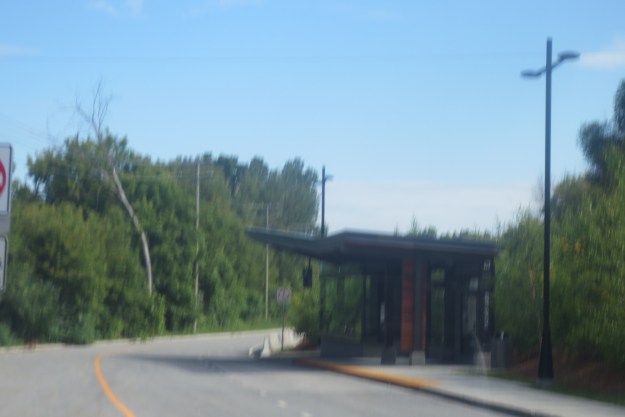
The Rapibus stations all employed a similar architectural expression. I liked the hockey stick roof slopes better than I thought I would after seeing them proposed for most of the Ottawa OTrain stations. The protected-from-the-weather undersides were wood, which warms up the sturdier areas where building meets passenger. Several stations had a large-ish main shelter, and a secondary shelter too:
Secondary shelters can be built further down the platform, providing a mix of outdoor and indoor waiting zones. It also allows station platforms to be extended economically by simply adding another pavillion.
these two pictures show a major transfer point, with shelters facing both the city street with popular bus route and, in the background, a second shelter on the Rapibus busway too.
At minor stations, there was a suitably downsized version of a shelter, but still more significant than an ordinary bus shelter:
I really liked this tower advertisement for a station location, and think they should be at all Rapibus stations. Like the bright red bent metal pipes of the Transitway, one can spot the station from a considerable distance away and especially in unfamiliar areas feel comforted by the presence of a familiar face:
Earlier Ottawa approved this artwork [LocomOtion] for the Carleton U OTrain Trillium line station. I’d like to see it at many more — maybe all — stations, and plastered in neon letters on adjacent buildings:
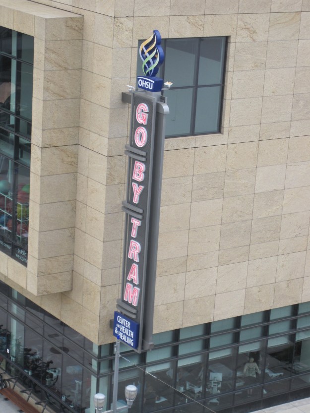
Here’s one such branding from Portland (there was a whole series here previously), where big neon signs are an important part of their transit image:
In future stories, we’ll look inside one of the big Rapibus Stations and drool with envy at their fine features.


A bit better than some Ottawa bus shelters
The Meanest Bus Shelter in Town?
http://spacing.ca/ottawa/2014/08/29/image-moment-meanest-bus-shelter-town/