My preference in seeing a place is from the walking around eye view. But sometimes a pigeon view helps too. Here is an aerial photo of downtown Orestad of just a few years ago.
The giant Field indoor mall is dead centre; immediately to its right is the Orestad elevated metro station, and the parade of glamour buildings extends up and down the picture just to the right of the metro line.
Just above the Field mall, there is an eyebrow shaped canal and street, which is a business district to visit a bit later. For now, we will focus on the big park with diagonal paths in it, and the the various apartment buildings surrounding it.
At first I thought this was a building under construction, but it is an above ground parking garage for adjacent apartment (and office?) buildings:
This is the finished skin. Rather less glamorous parking for the middle class. It didn’t look to me that the floors were high enough for future conversion to residential or office use:
In many ways I am surprised to see that prime by-the-metro line space was being allocated to a parking structure. Here is the adjacent apartment building. Some units have balconies, most do not.
I do like dark brick or materials for accents on a building, but I am less thrilled with all dark exteriors. Maybe it reflects the current zeitgeist. Note that it is the still-popular podium with a slender tower that planners love:
Here’s a closer view of the upper floors with a wire-mesh screen:
There were a number of similar but slightly variant buildings in a row:
It appears to be made of prefab concrete panels, shown here before the veneer of brick:
This smooth panel exterior apartment building came as a visual relief:
I suspect that the large surface parking lot in front of this building is temporary, and as a more walkable city is developed, the lot will become another apartment building built up to the sidewalk. If so, this would have the additional benefit of being of a two-decades newer design, adding a more organic feel and variety to the neighbourhood as opposed to the all constructed at one time homogeneity:
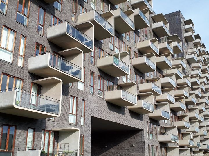
These balconies add visual interest and cast shadows across the exterior surface of the building:
Between the buildings were courtyards and landscaped personal-sized spaces that I felt comfortable in. If you look again at the aerial photo, you can notice that many buildings are U-shaped, around a courtyard. These date from planning about 15 years ago, and are pretty much identical to LeBreton Flats on Lett Street, with buildings close to the sidewalks to create street spaces and spacious courtyards behind and between:
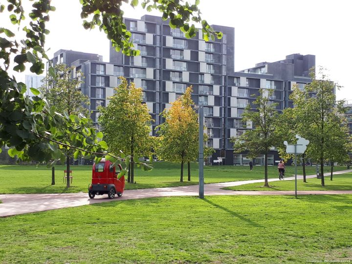
There is a very large central park. I tried to adjust my perspective to imagine it in 20 more years, when trees mature and more features are added. Because right now it is stiff, bleak and isolated feeling. Contrast this to the new park spaces in Clichy-Batignoles seen just a few stories back…
A rather unconvincing small mound attempted to offer some visual relief, but the handicapped accessible picnic zone was attractive even if remarkably small for such a high density area.
This is an area not to be mowed, a bit of a tall grass zone:
This green glass building elsewhere in Orestad offers a cheap-and-cheerful design. Interesting exteriors don’t have to be just for the most expensive apartments. Residents, though, have complaints about always seeing the world outside through tinted glass:
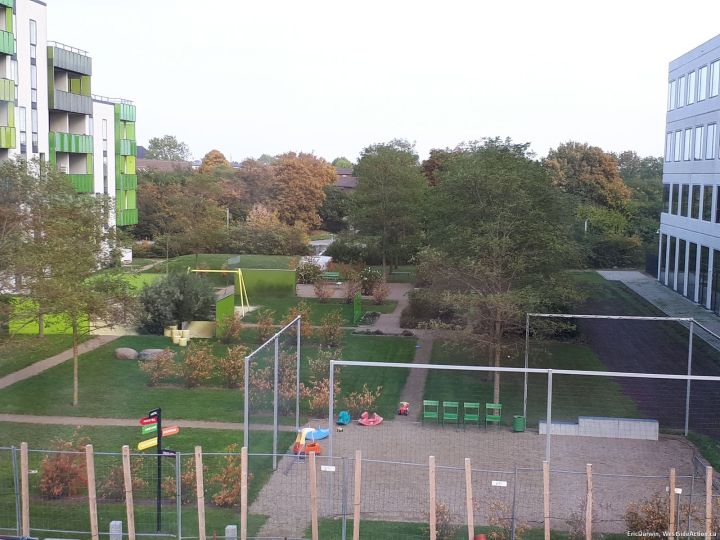
The littlest motorists seem to have made use of this gravel soccer pitch (note the high fences and nets) probably aimed at younger children not yet trusted to be off to the bigger playing fields. Note the sociable line of city chairs for parents/nannies. No play structures, but a conventional swing set is visible:
For these units, our view is back to the more glamorous, mixed use side of the elevated metro. The same building is shown from the courtyard and the street side:
Alas, the grass is not always greener:
Next: Orestad downtown business district, and some misc construction observations.


Watching the photos, I can’t say I am champing at the bit to move to Orestad. It looks desolate and planned with very little creative elements, other than an odd shaped balcony. Dare I say, unimaginative and boring? You probably tried to keep people out of the images but how did it feel walking around there?
If you look closely, perhaps by enlarging the photos to fill your screen or desktop monitor, there are actually a lot of people moving in the backgrounds. The sidewalks were populated with people, quite a few. But the spaces were so large, tbe walks so long and wide, that peeps seemed to get lost in the voids. The spaces look much better driving at 50kmh. Other than at rush hour, how busy are ottawa sidewalks?
With a view to learning something for us here, can you comment on the planning and regulatory environment that produces these interesting integrated sometime imperfect spaces? This fuels the age old debate regarding how much city planning (by talented bureaucrats) assisted by neighborhood groups, is enough or too much. before developers start squeezing in all the floor space and height their accountants tell them they need..Oh, and need I mention, considering our ckimate.
Meanwhile, on Dows Lake – where once upon a time, residents successfully blocked a full sized Dutch Windmill from being erected because it would attract too many tourists – we have the 45 story tower.