Ghost bikes. Painted white, adorned with plastic flowers and teddy bears. Chained in situ where people who ride bikes come to a fatal end. A sobering reminder to others to drive carefully.
Ghost pedestrians. Cut out 2-D manikins shaped like the walking figure on crosswalk signals. Reminders of the risk people who walk face everyday in a transportation environment skewed to favour people who drive cars. Another sobering reminder of how close death stalks everybody who dares walk in the motor-age.
These memorials upset some people. Clutter, some say. Hazards, say some. Creepy, opine others. Valuable reminders, chorus some. Hide them away somewhere, politicians suggest.
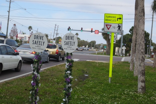
I noticed these signs in another place. I kinda liked them. They are more subtle than ghost bikes. They include names, which makes the associated deaths more real. They do not specify the mode of death. The standard post still permits personalization by grieving families and friends. The signs are aligned where stopped motorists can see them and contemplate on mortality.
I wonder if that florescent sign about right turns appeared before or after these deaths. The illuminated sign on the traffic signal prhobits right turns on red (note the crossride a bit to the right on the crossing road). When the traffic light goes green, the message on the overhead sign changes to tell people who drive to watch out for people who walk or bike.
I’d like to have seen a date and vehicle of death mentioned. But that’s quibbling.
Should we have signs like these in Ottawa?
http://www.legacy.com/obituaries/dispatch/obituary.aspx?n=david-b-happeney&pid=145529342


At the risk of starting something… (wait, you just did!) I do like the sign idea.
I often pass by the ghost bike at Bank and Riverside, and two friends of mine knew the woman that was killed there. I have no problem with the concept, and think that everyone needs to be reminded. That said, I find the constant redecorating of this bike with holiday themes to be rather tasteless. What really is the point to cluttering an already tight spot (that hey caused an accident!) with pumpkins, or an Xmas tree, or (most recently) full St. Paddy’s Day green. It’s to the point that you don’t even really see the bike, which dilutes / obscures the message.
I just witnessed someone be almost creamed by a right turning vehicle who did not check for pedestrians (who also had a walk signal). I think we all need reminders to be safe on the streets and to share them.