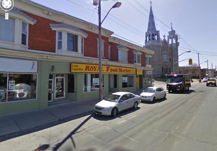
A strip of stores in Hintonburg was somewhat attractive before, with a row of bay windows on the second floor, a built-out cornice line, and green-painted brick storefronts below (the block is obviously the result of earlier renovations).

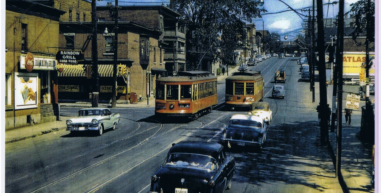
But with the explosive gentrification of the neighborhood, a property owner decided the place needed a re-do, one that “modernized” the look. (I do wonder what it might have been like if he had gone for a faux-heritage look…does anyone have a heritage photo of the previous storefronts pre 1960’s??)
The first phase to be redone was the west side, facing St Francois Church and Fairmont Avenue:(pic from first week of December)
Notice the cornice is gone, and wood strapping is being nailed onto the exterior, sure sign that a new covering is coming. And… it looks like it more corrugated metal siding, this time put up horizontally. Corrugated siding is to the current day what aluminum siding was to renovators thirty years ago: ultra economical.
It is an unfortunate oddity of our tax laws that in cases like this there is no incentive for the landlord to go the expense of adding insulation or draft proofing because he doesn’t pay the utility bills. Most tenants won’t insulate, because they are on short-term leases and won’t see the payback. So older commercial buildings continue to stagger on, uninsulated, drafty, with crappy plumbing.
For this row of buildings, huge gaps appear around the steel beam supporting the second floor, but I saw no evidence of insulation or spray in foam being applied. I guess all that infiltrating air might keep the ole floorboards dry.
The western façade is pretty boring: horizontal siding only, with just a bit of darker siding under the windows. But on the north side, facing West Wellie, some different materials were brought into play. Hardiboard, man-made synthetic wood panels, have been placed between the window units. This reintroduces a vertical element to the frontage, a sense of rhythm, and some (artificial) warmth:
This commercial strip was a long way from being heritage storefronts, unless 60’s renos are now heritage. Landlords have the right to modernize their facades, if they think that will attract better tenants. Tacky renovations will quickly look dated and sad.
I look forward to seeing some sort of horizontal roof line put back in above the storefronts, although the landlord might go all-modern and leave it stripped off.
Life in older urban neighborhoods is full of change. This project has given employment to sidewalk superintendents and critics.
What do you think of it?


Not a fan of neo-shantytown corrugated metal siding. Cold and antiseptic at its best. Cold and cheap looking at its worst. This case strikes me as a half-hearted attempt at “modernizing” the ground floor without looking at the entire building. On the plus side, it’ll be easier to restore the more classic look of the building 10 years from now when the tenants demand it.
I don’t hate it, but I wonder if this modern new look will seem classic in 20 years, or just dated?
That strip did need a spiffing up. It already seems like some up market places have gone in, which is good.
I really don’t like it. It was a building with so much potential (think of the one further west near Carruthers). I think it will look cheap and dated in less than 10 years. But it will employ someone else when it needs to be redone.
I tend to agree with you, that when renovations are made in districts where a certain fashion sense has been a part of the area for decades, it is nonsensical to try to change things in a way that doesn’t fit in with what is the general neighbourhood look.
But, how does one control these changes, when new owners have no intention of keeping up with the traditions of districts that are decades and decades old, or even older??
Thank you! I loathe this ‘renovation’ with every fibre of my being. Loathe. It. Every time I walk by, I audibly curse those who would cover up that (albeit painted) brick and tile with this abomination. Ugh. File this under: “future blight”. I think, in some contexts, it is possible to make that corrugated metal look…decent, but it’s difficult. They had a building with good (aesthetic, anyway) bones that needed some touch-ups, and they got out a sledgehammer and ruined it.
Well, this is future blight over old blight. Looked awful and dated before, the jury’s still out on the new look since we haven’t seen the finished product. Notwithstanding the quality of the renos, the new look certainly fits better with Bridgehead then Cozy’s!
But what about the Preston Pizza face lift? It seems like they got the left over stone facade from the pasta place renovation. Its nice to have a few places close together with a similar look. On the other hand the stone does not go with the polished black stone tiles on the pasta place and Luciano’s. The stone does look nice on the front of Preston Pizza. I only hope that they have applied enough spray foam to keep the wall facing Eccles from collapsing.
I like what they have done with this building. It has a very “west-coast” look to it and short of tearing the building down and starting over, I think they did a good job. It adds to the visual character of the building overall, which is very lacking in the new condos being built closer to Westboro.
Also, far easier on the eyes than the Men’s Room Green painted bricks now buried underneath!