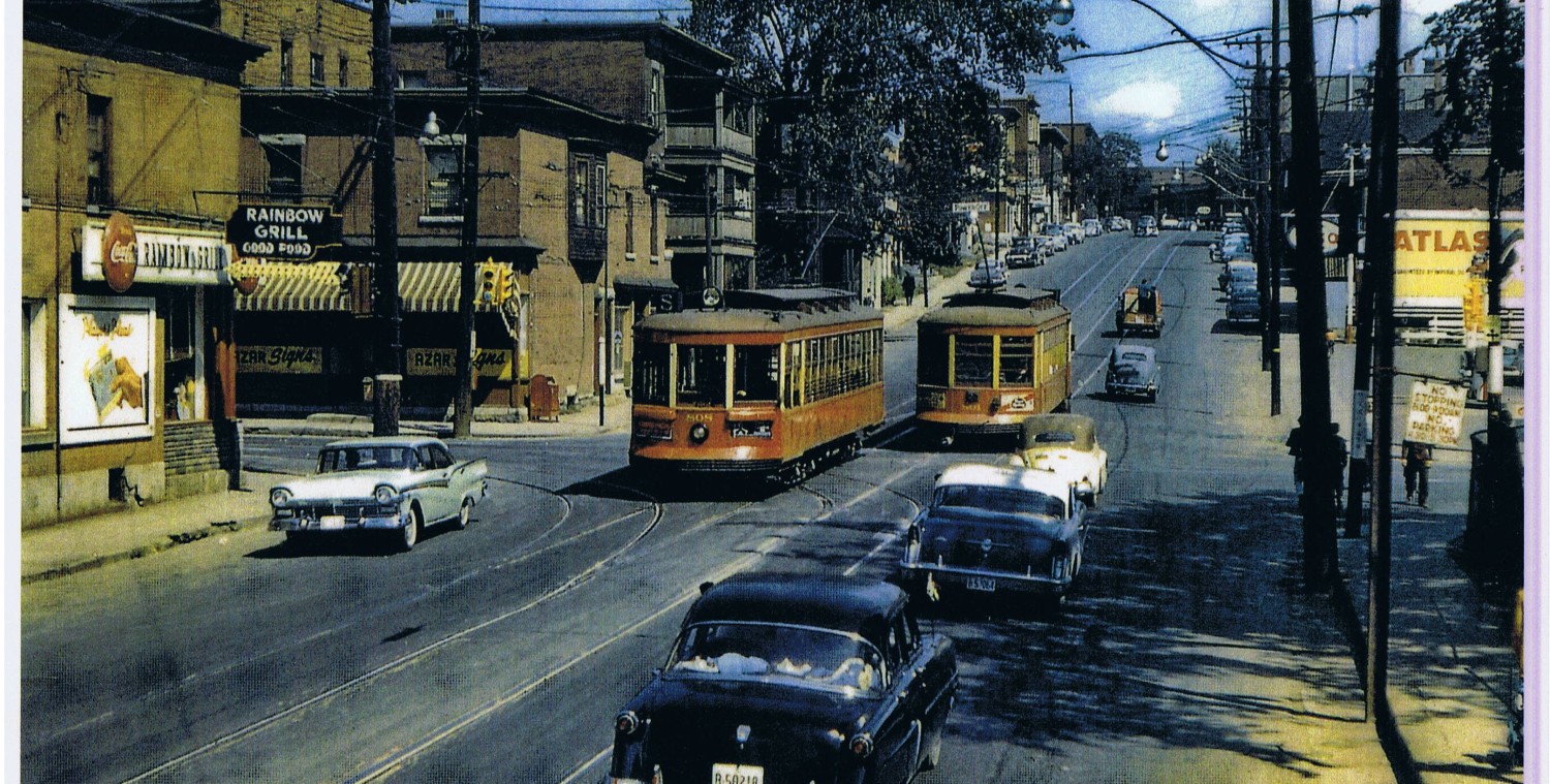
West Wellington in Hintonburg is a traditional main street (TMS). The community design plan allows for new buildings up to six stories “as of right” along the active shopping and commercial street. It also permits taller structures, upon application, at nodes or gateways.
Where West Wellington takes over from Somerset Street, at the triangular-Somerset-Square, Beament et al law office wants to build a mixed-use building to 9 stories.
Instead of trying to “blend in” with traditional or modernized styles, they have opted for a building as a stand-out sculpture. I suspect that is because the Mizrahi condo at the corner of Wellington and Island Park successful won approval based in part on style.
Here is an illustration of the proposed building as viewed from Somerset Street, with Bayswater Road behind us, and the LCBO straight ahead at the corner of Armstrong, and the Somerset Square park on the immediate right. Suzy Q donuts is somewhere hiding behind the tree.

The heavy black outline of the lower “podium” portion of the building is similar in scale to the LCBO building. The glass tower with white outline and diagonal exoskelton is the sculptural part. It will have views of the River and Downtown. It is within a few hundred feet of the Bayview Station with north-south and east-west train lines. I am confident the city wants the building for tax revenue and intensification. It should prove a successful location for tenants too.
Here is the view looking east from Wellington St, with the very familiar store front on the immediate left:

Traditional main street zoning in Ottawa usually just includes the lots facing the main street, and occasionally one or two lots down the side streets. More recently, there is increased awareness that the developments are more economic (given current tax, planning, and financing public policies) if larger [or higher]. I have noticed in other cities that the lots behind the TMS are include-able or included in the TMS zoning. This permits the sidewalk level to be commercial along the main street, with the residential entrances from the side or back street where it is quieter. The larger floorplate of the building is more economic to serve with elevators. And most crucially, the parking garage is what drives the whole building.
On the Armstrong Street side of the building, there are significant step-backs which reduces the apparent mass of the building and creates some attractive outdoor spaces at sidewalk and (only the first) roof terrace levels:

I give kudos to the proponent for including sidewalk-level pedestrian-eye views of the building. This is the view that matters to most of the public. They didn’t even photoshop out that public utility pole … perhaps because it provides scale, or because Ottawa politicians think these poles are aesthetic. I am a bit surprised the public power utility isn’t moving the poles back behind the sidewalk … which could possibly reduce the buildable area of the lot. Mind, the current pole location is great traffic calming and it protects the sidewalk.
Here is a view of the front with its seductive scene of vibrant sidewalk life. Provided the space is leased to a cafe, and isn’t law offices. Although Lucy might set up a Legal Advice 5c booth …


No word on where the moose currently on the roof of the law offices will go.


I’m pretty sure Armstrong has been rezoned to TMZ too. Not sure what was the thinking behind that.
Why are Ottawa municipal/planning/architecture observers so fixated on utility poles?
Hydro Ottawa are very stringent on building setbacks to existing utility poles. Generally 5 metres back.
In smaller municipalities the municipal snow plow operators carry a lot of clout in the density allowed and how tight buildings or parking areas can be to lot lines.
I like it. Ottawa needs more standout buildings. The moose would be lovely as sculpture outside.